
CASE · SHOPIFY
Void
A dark, quiet Shopify store. The shell stays clean. Built by DreamTaken.
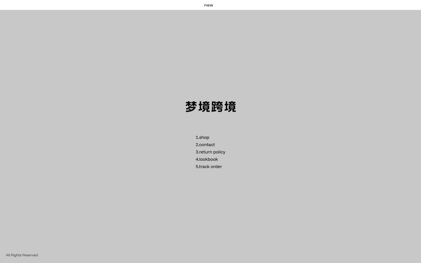
Quiet is not the same as deleting modules
A lot of “minimal” stores just removed two pictures. The navigation and checkout are still the theme default. Void wants the shell itself to be quiet: type, space, and dark layers hold the product. Promo bars and full-screen popups stay off the main path. When the product is the visual, the site should not add another layer of noise.
The company on the work is 深圳宇成跨境科技有限公司. This is a delivery, not a dark theme pack.
The structure
Little decoration. The type does the work. Collections and product pages can still be bought. The density stays low. On a phone you see the product first, then the action. The Shopify account is the brand's.
Your store follows the plan you pick. If the product should be taken apart by scrolling, that is Motion, on Motion. The three plans are on Stores.
Who it fits
Stores that want restraint, and that do not sell by stacking promo modules. A large beauty image is Luxiel. A jewelry collection is Lumessence. More stores are on Work.