
CASE · SHOPIFY
Shrine
A Shopify outerwear store. A story on the first screen, then a path into the collection. Built by DreamTaken.
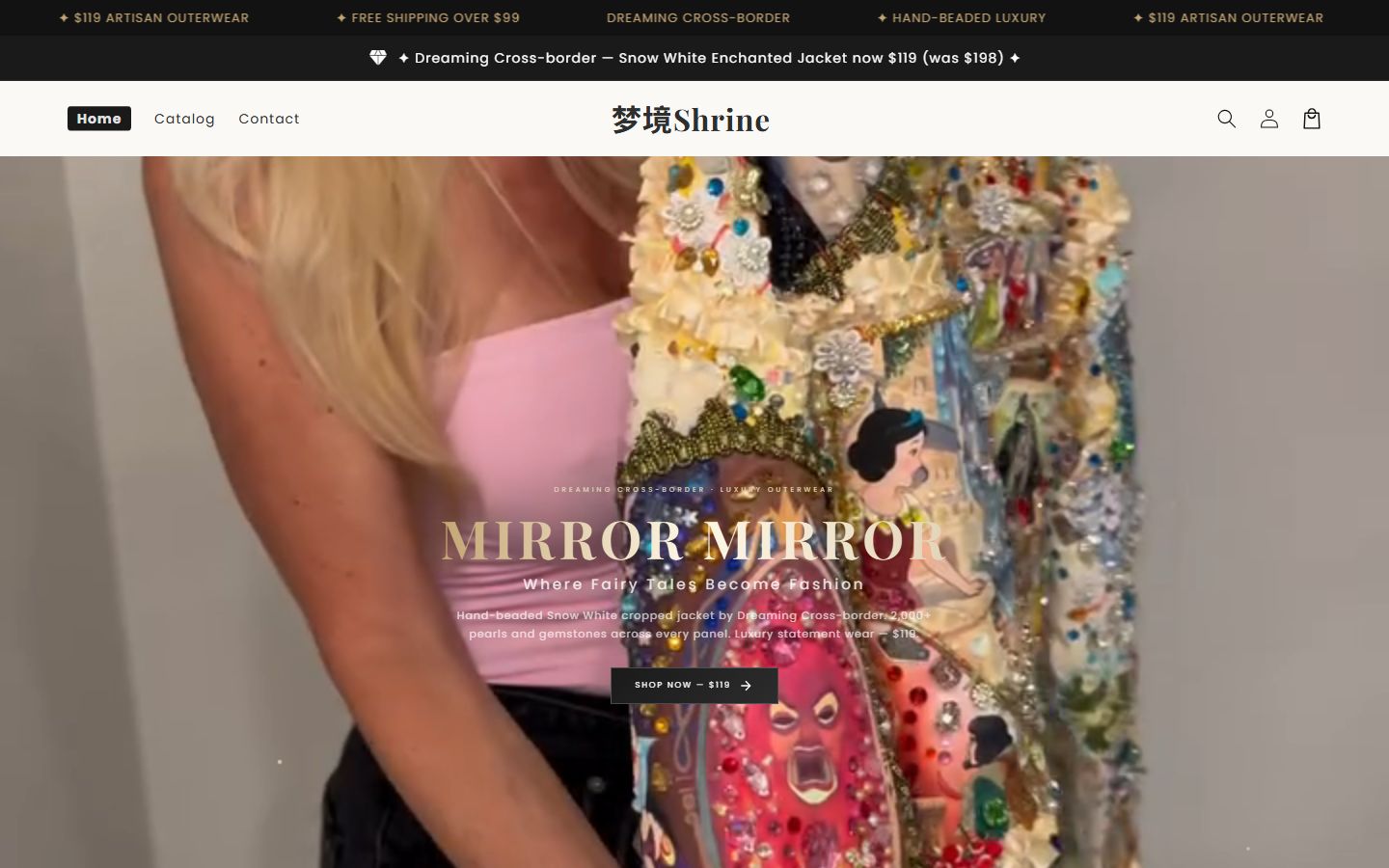
Outerwear is not a shelf
The decision is slow and the price is high. People enter a world before they decide the coat is worth it. A four-tile “new arrivals” grid flattens that. Shrine holds the world on the first screen, and the collection underneath can be browsed and bought. The story is the reason to buy, not a replacement for buying.
The company on the work is 深圳宇成跨境科技有限公司. This is a delivered structure, not a theme for sale.
The structure
The first screen carries the brand. The collection carries the range. The product page carries size, material, and checkout. On a phone you still see the story first, then something you can buy. After the story, add to cart is still there.
Your store is not a reskin of Shrine. It follows the plan you pick, on the Stores page. A scrolling film is the Motion plan, on Motion.
How it differs
A large catalog you browse by pictures is AokLok. A limited drop, full screen, is Trapic. Shrine is closer to “enter the world, then buy one.” All of them are on Work.